
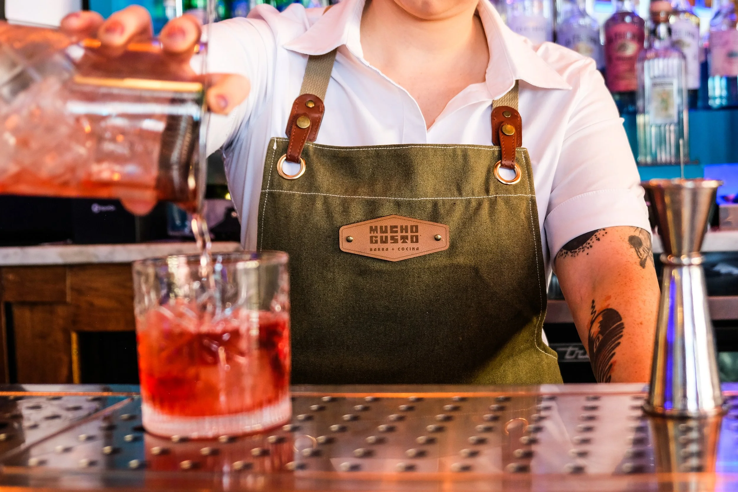
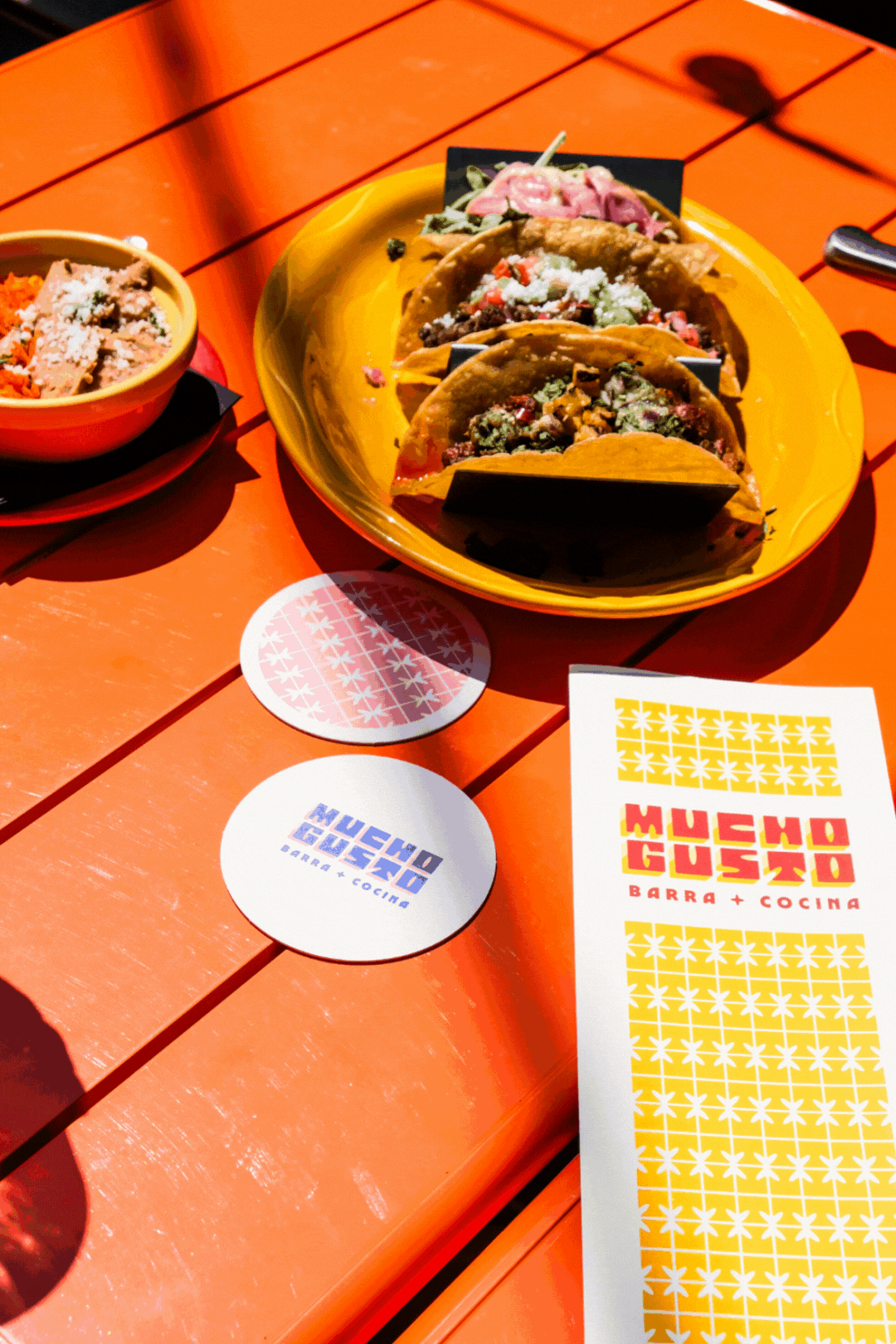
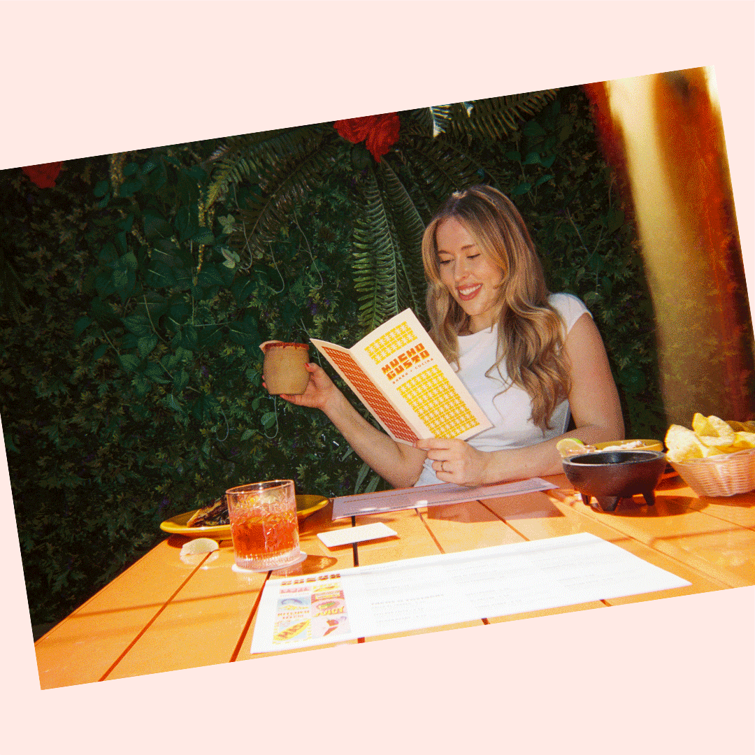
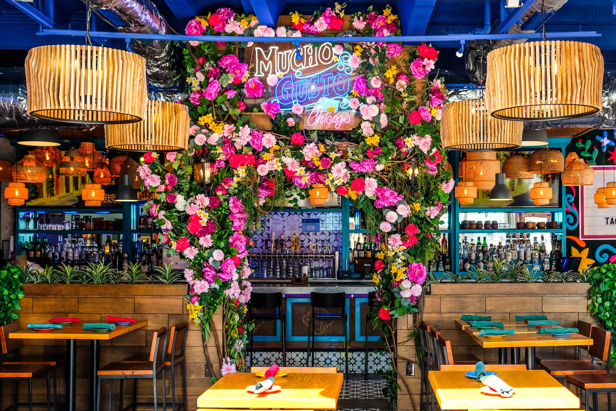
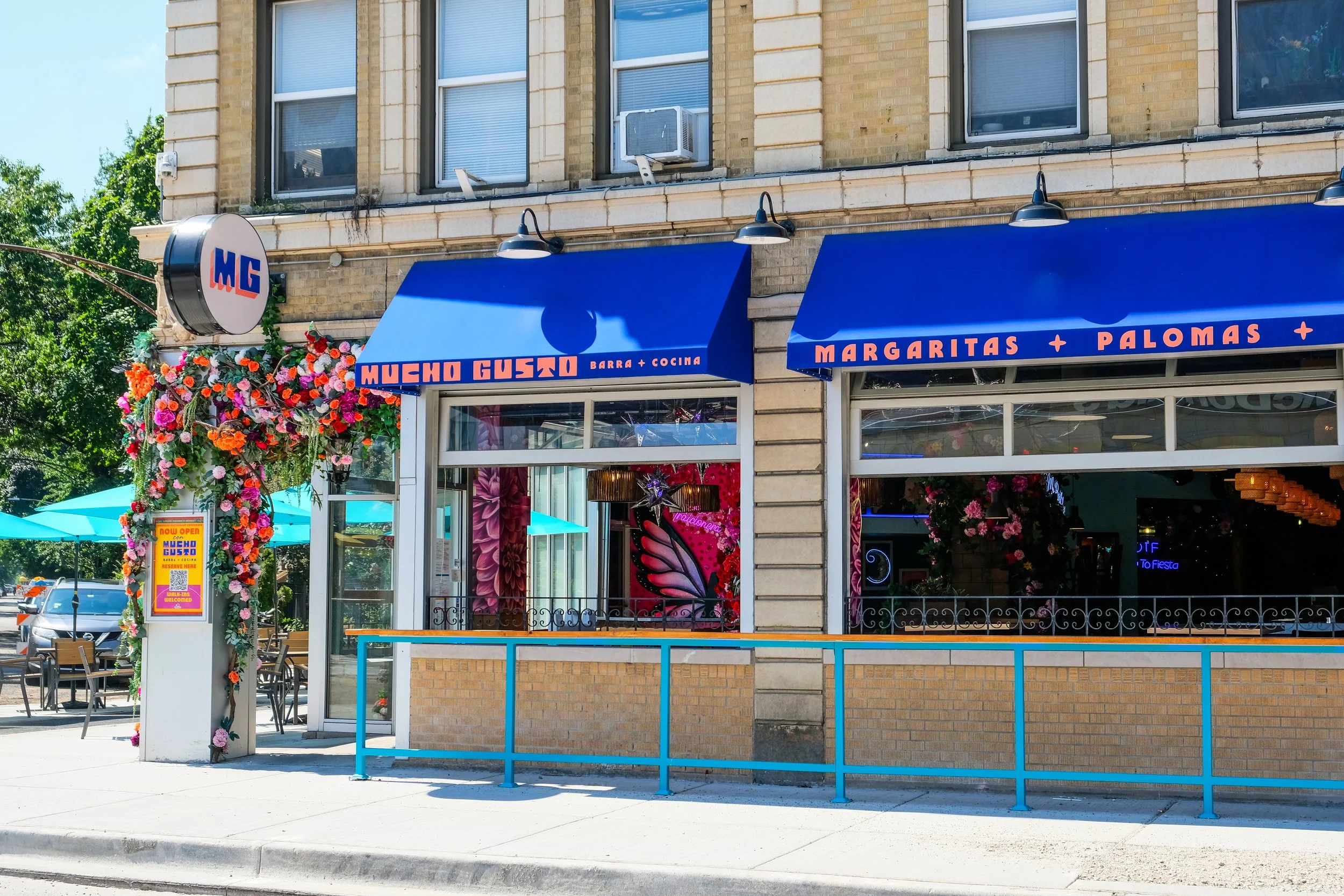
Mucho Gusto a vibrant Mexican bar and restaurant that embodies the lively spirit of San Miguel de Allende.
Chicago, Illinois
2025
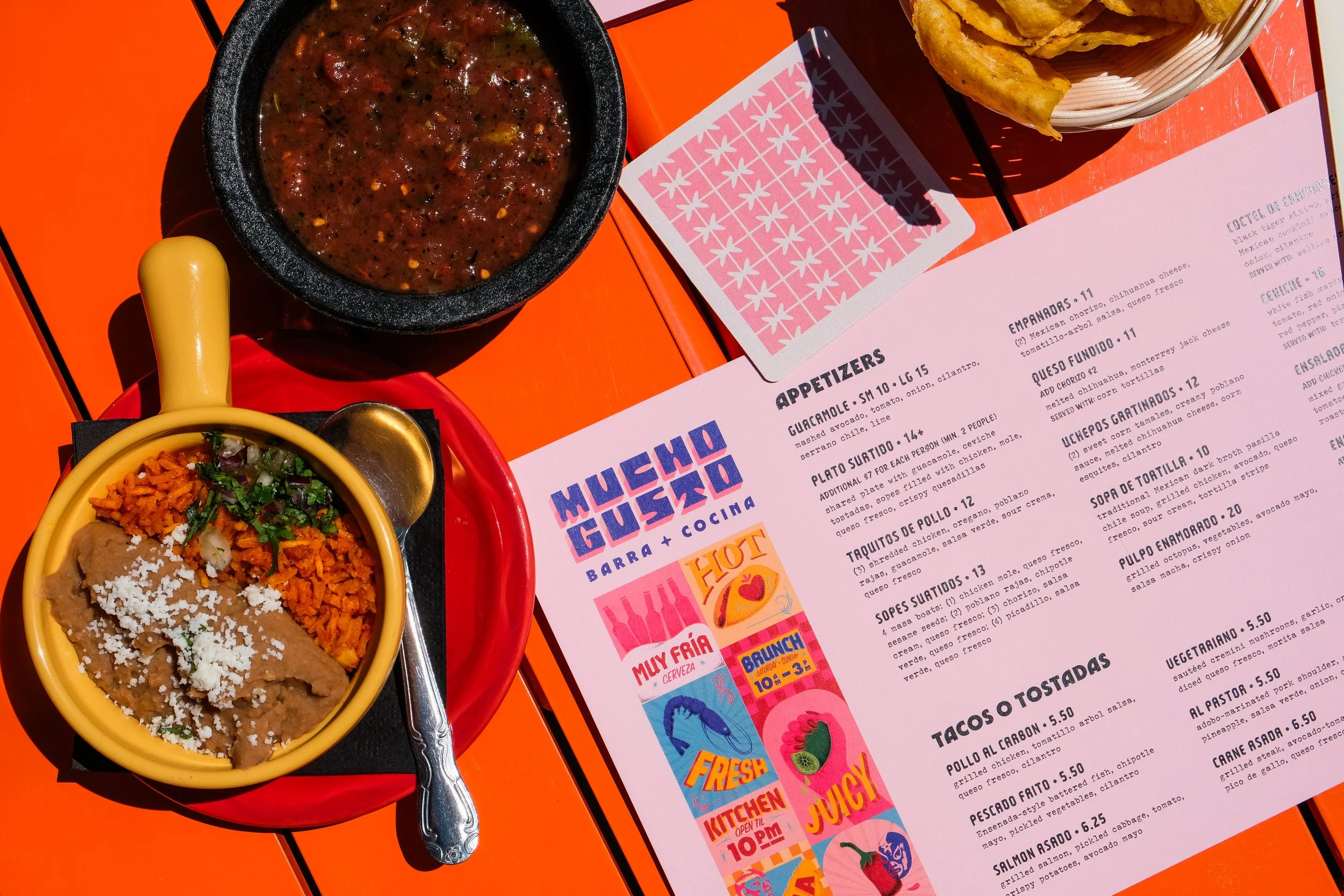
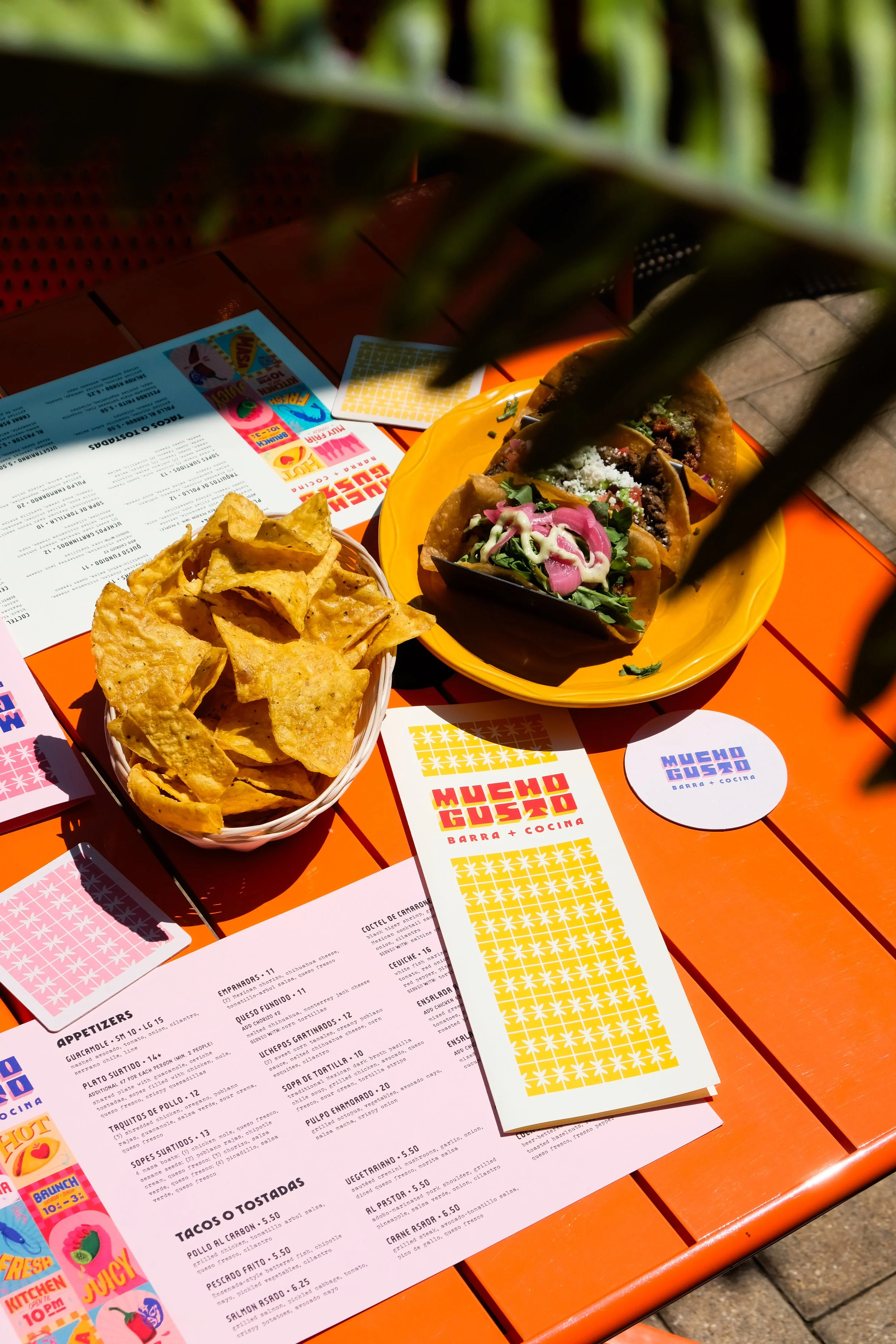
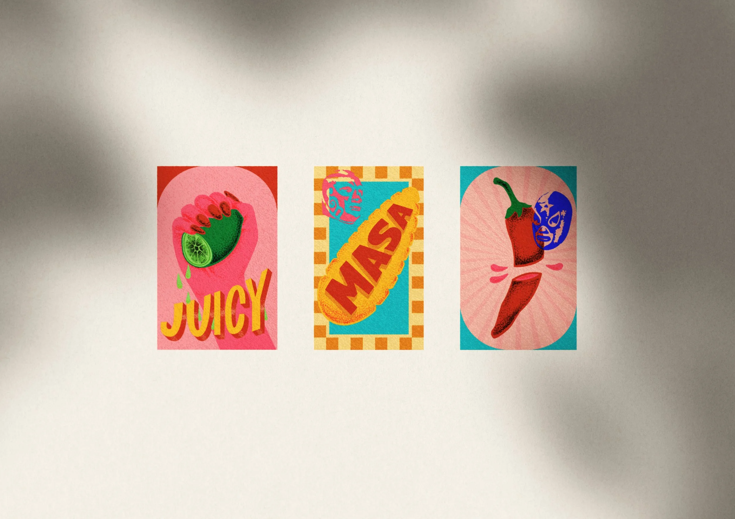
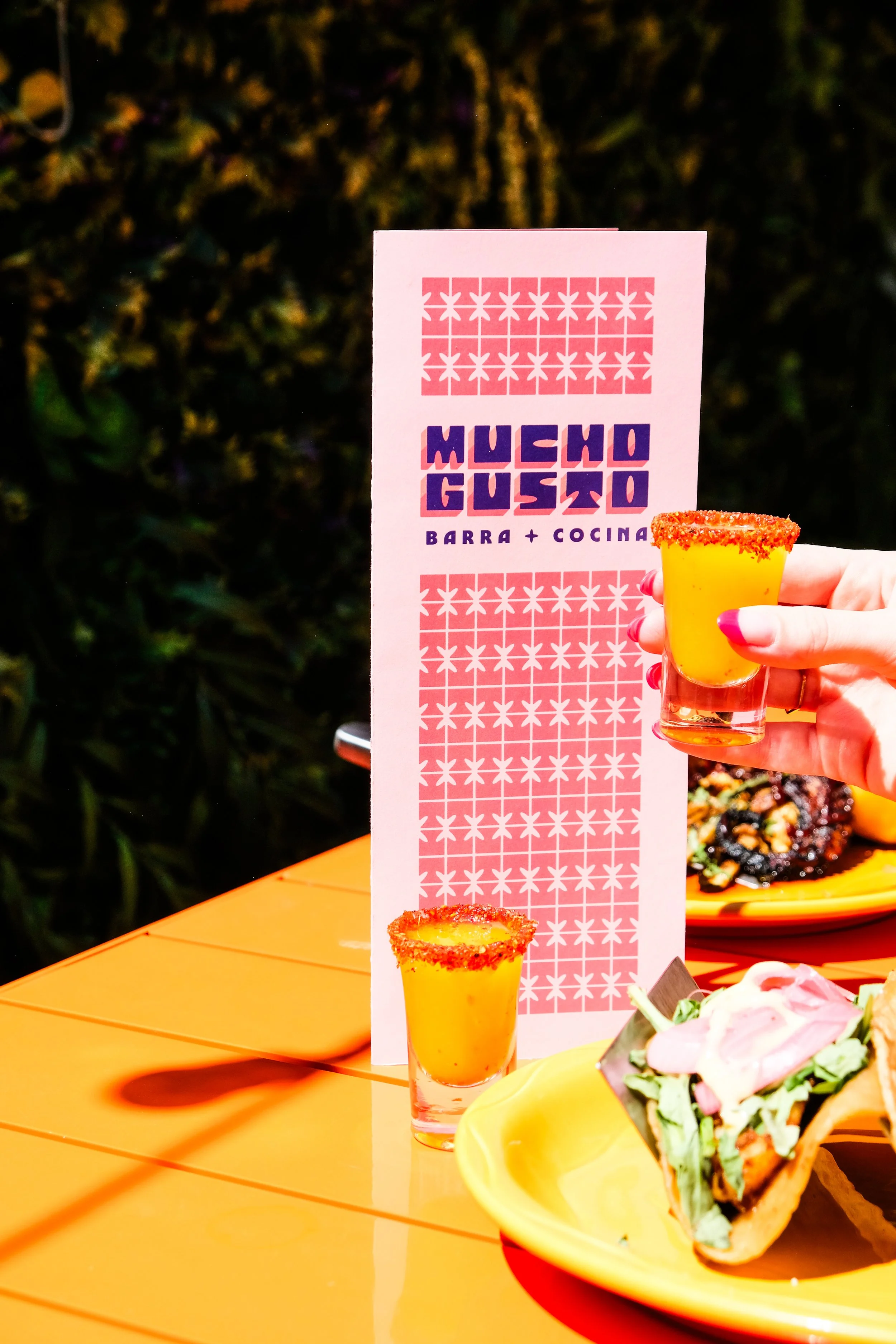
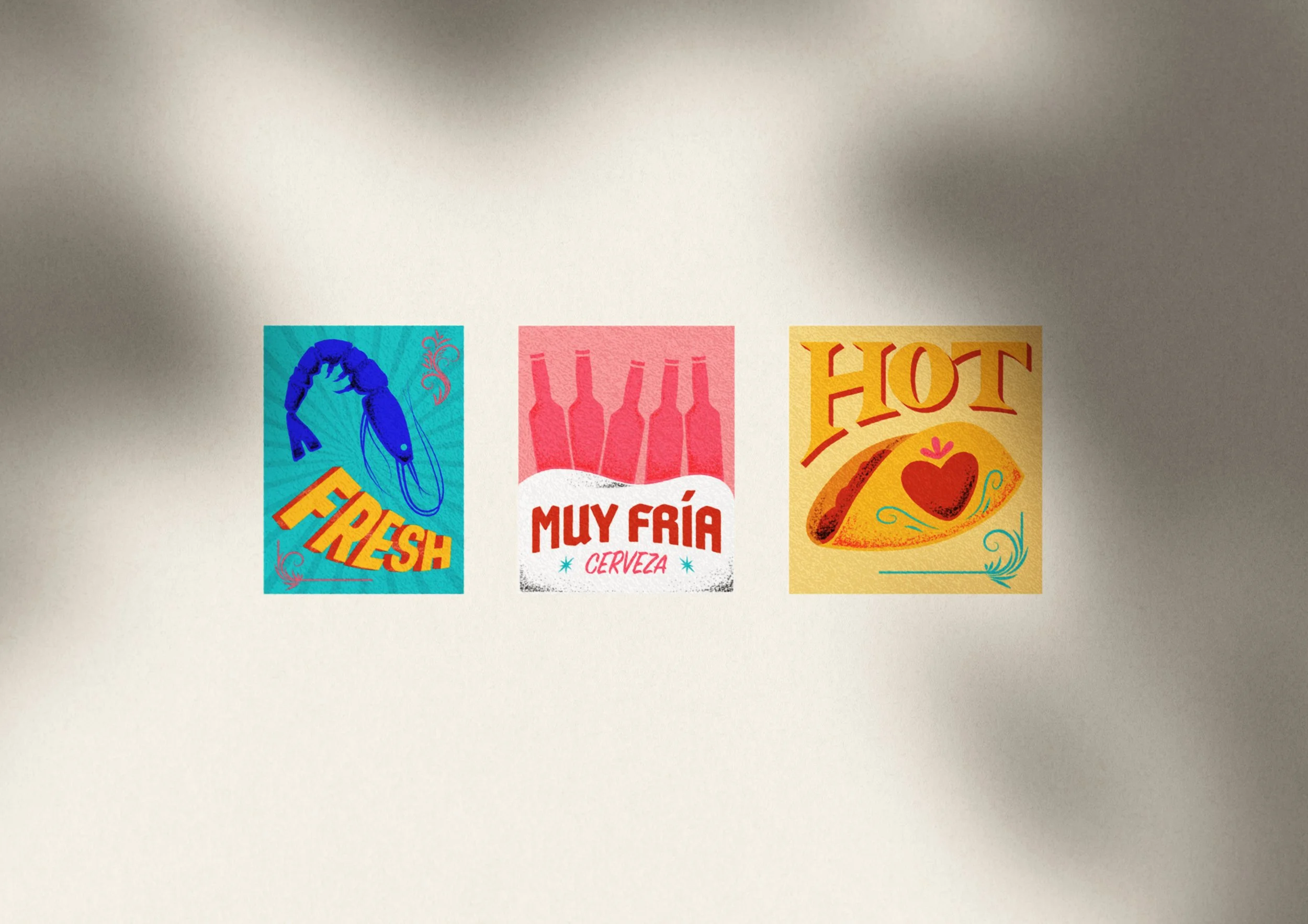
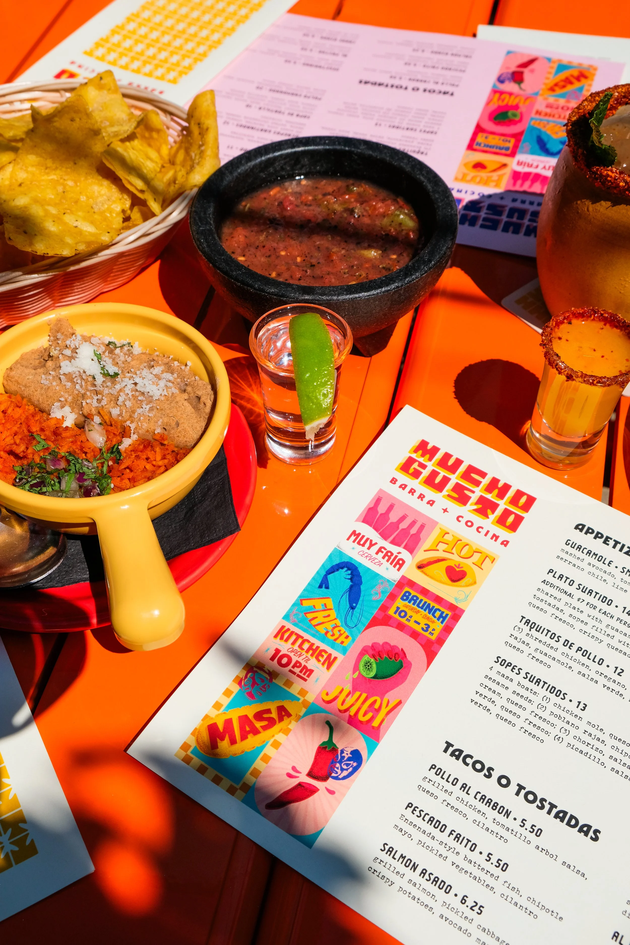
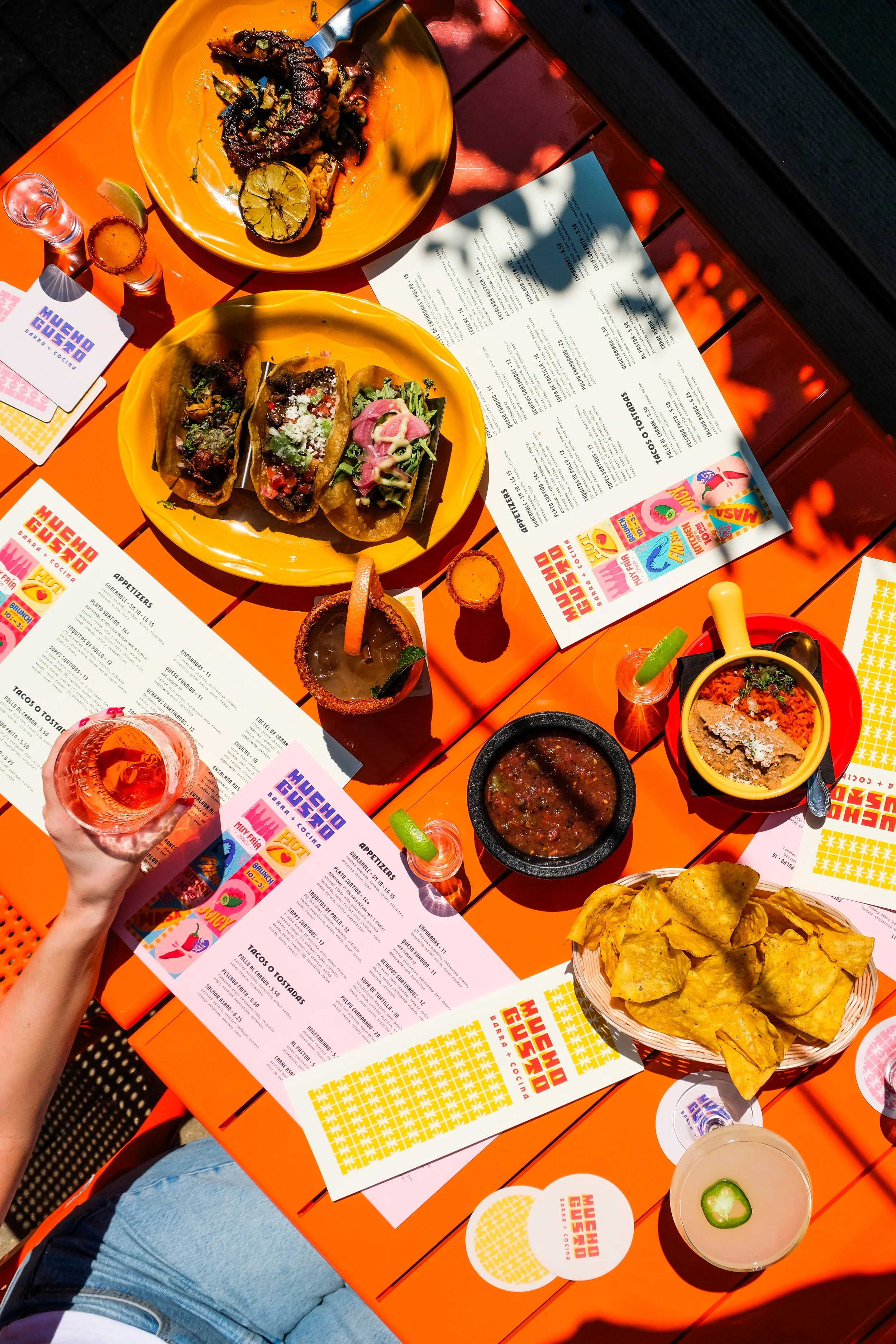
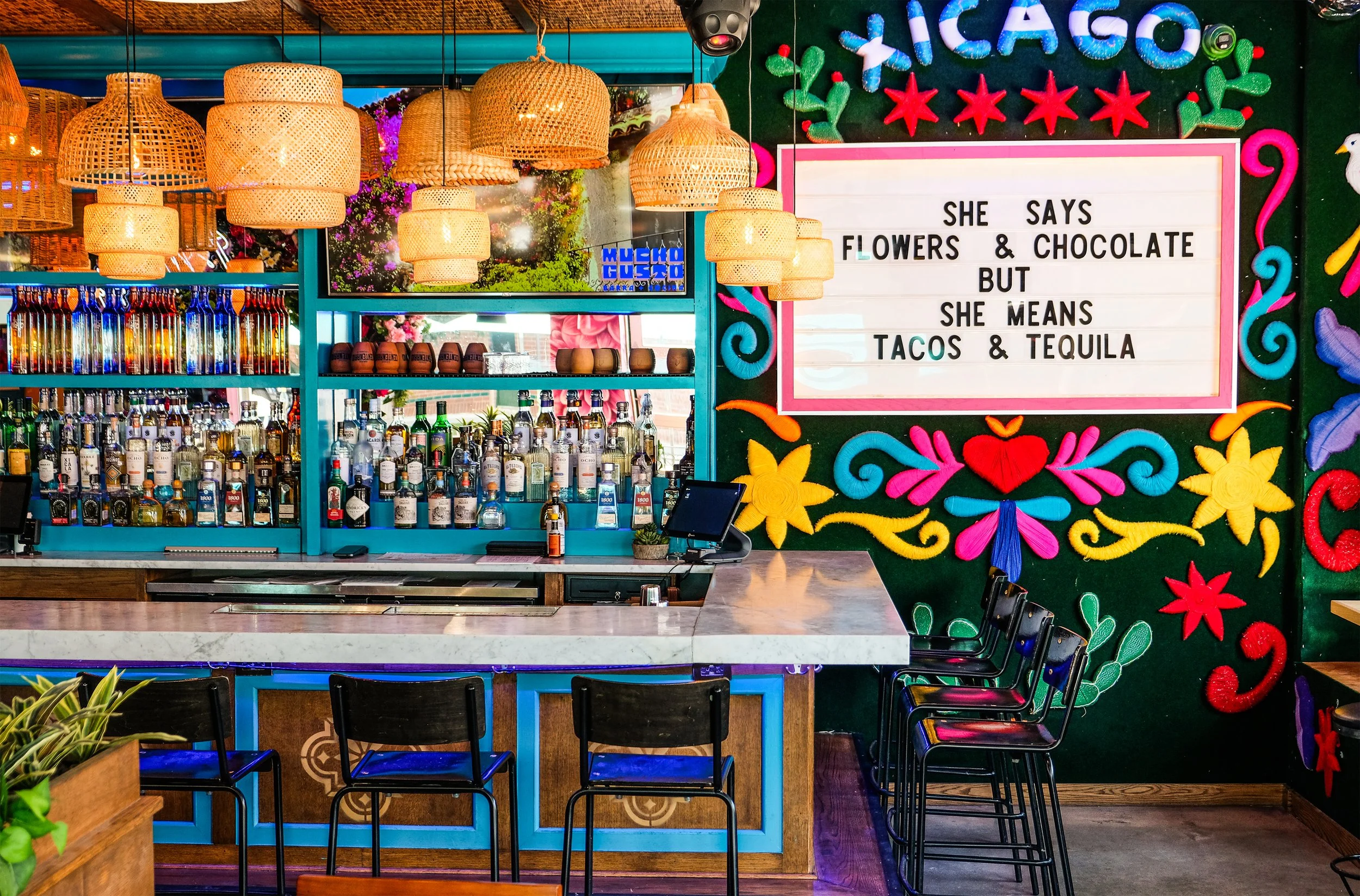
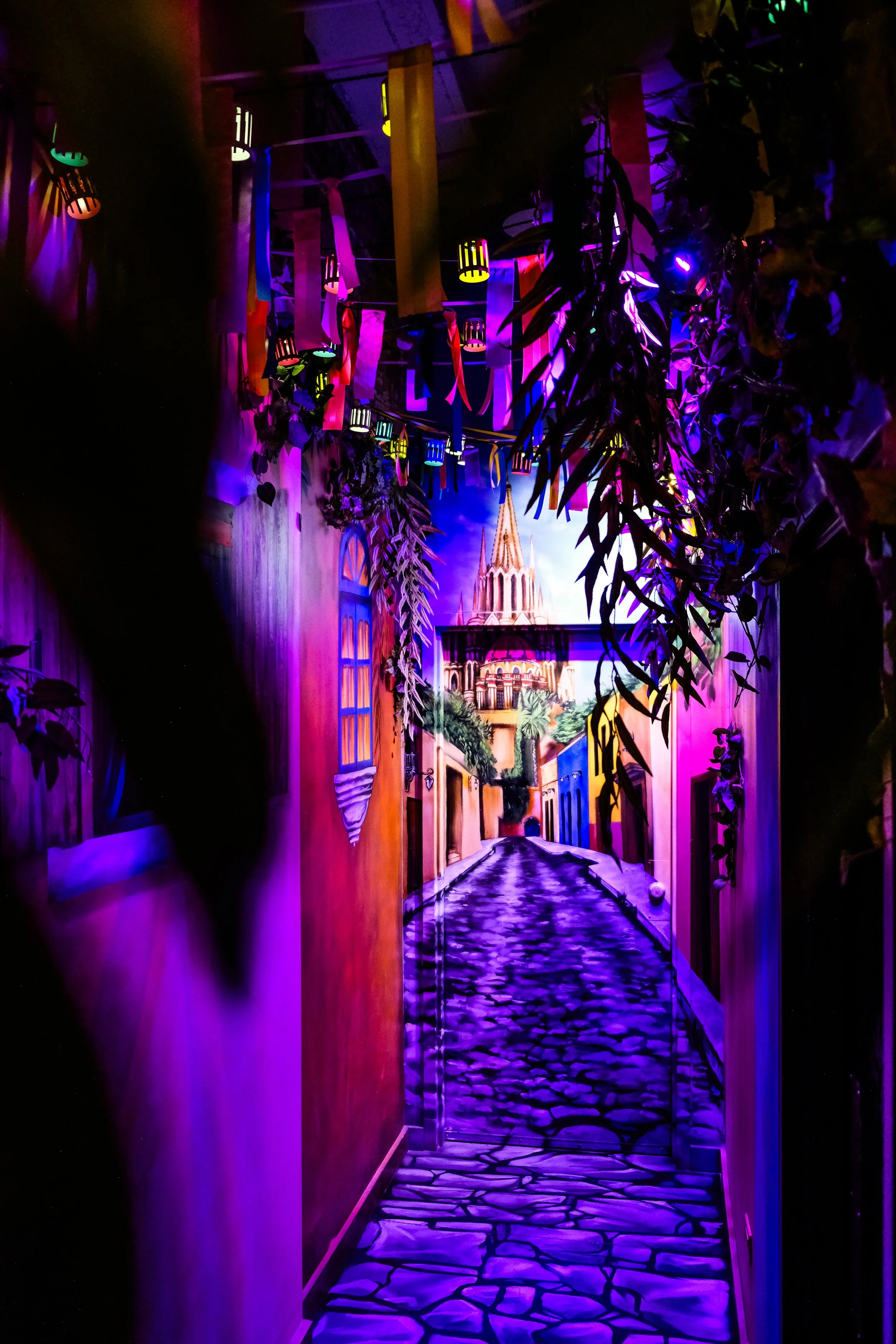
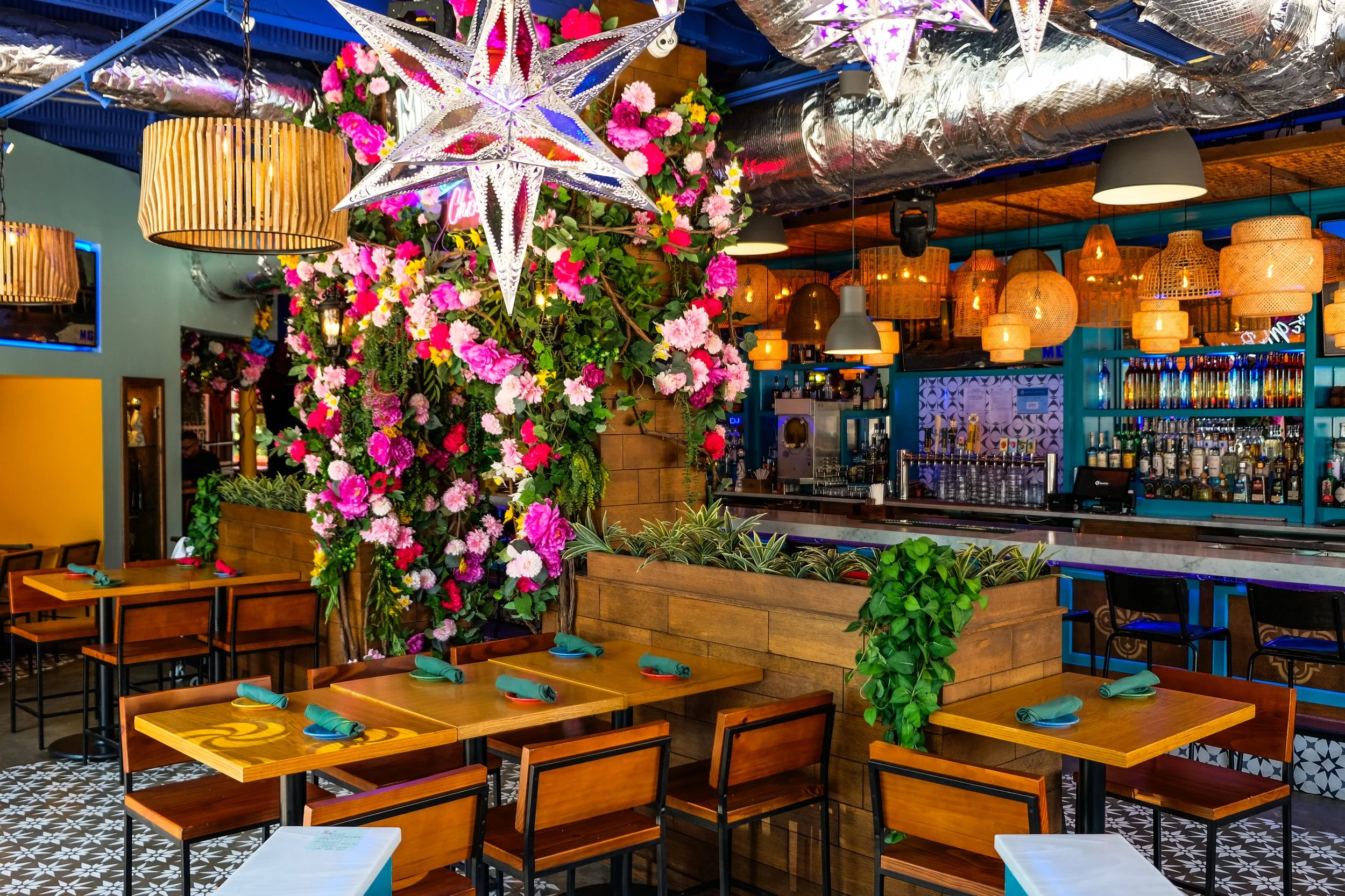
Inspired by leisurely trips to Mexico, our client brings the cheer of San Miguel de Allende to the Logan Square neighborhood in Chicago. The photogenic interiors are a mix of painted scenes, colorful flowers, silver lanterns, and neon Lotería cards. The brand identity celebrates the space through bright colors, patterns, and illustrations positioning Mucho Gusto as a party destination.
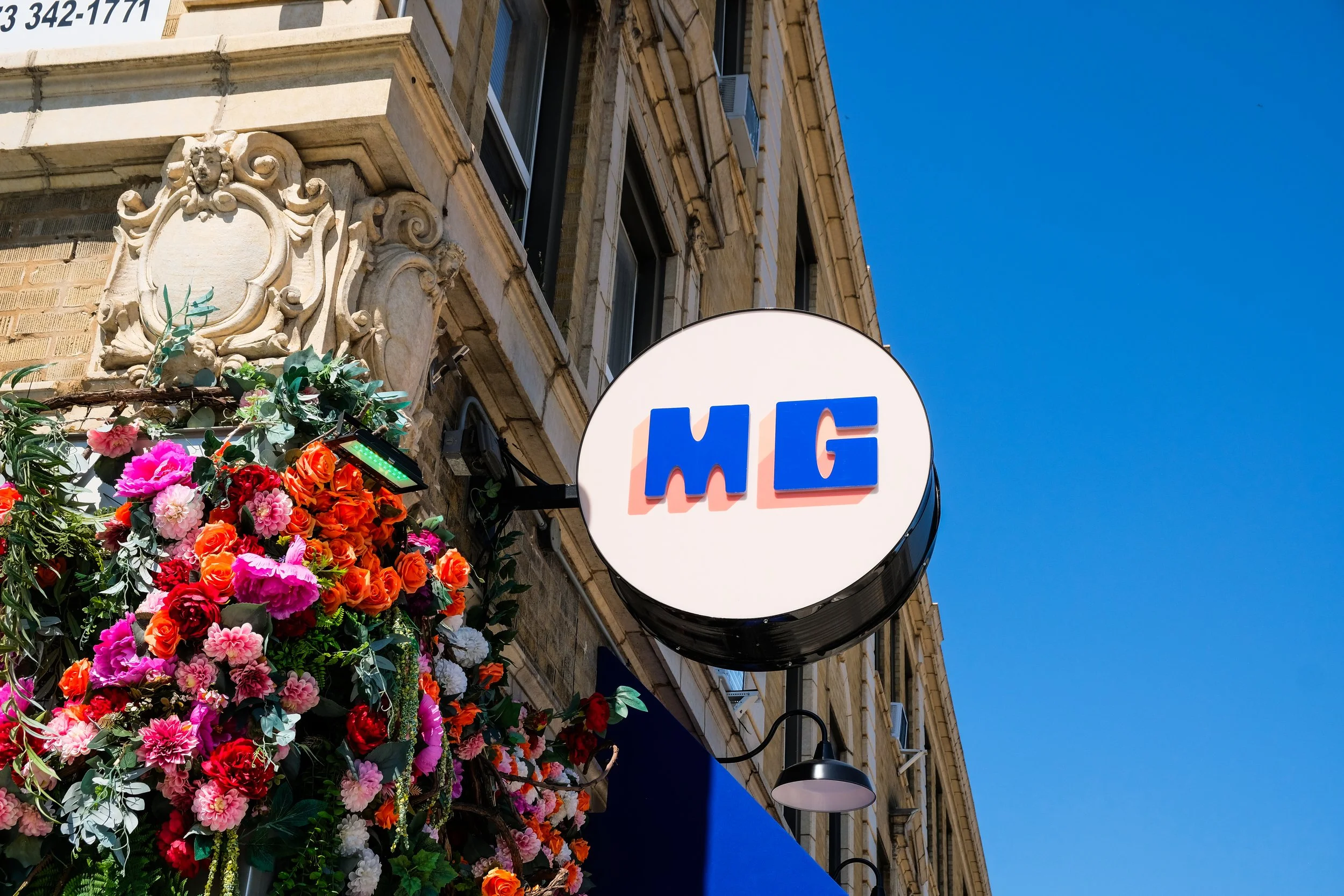
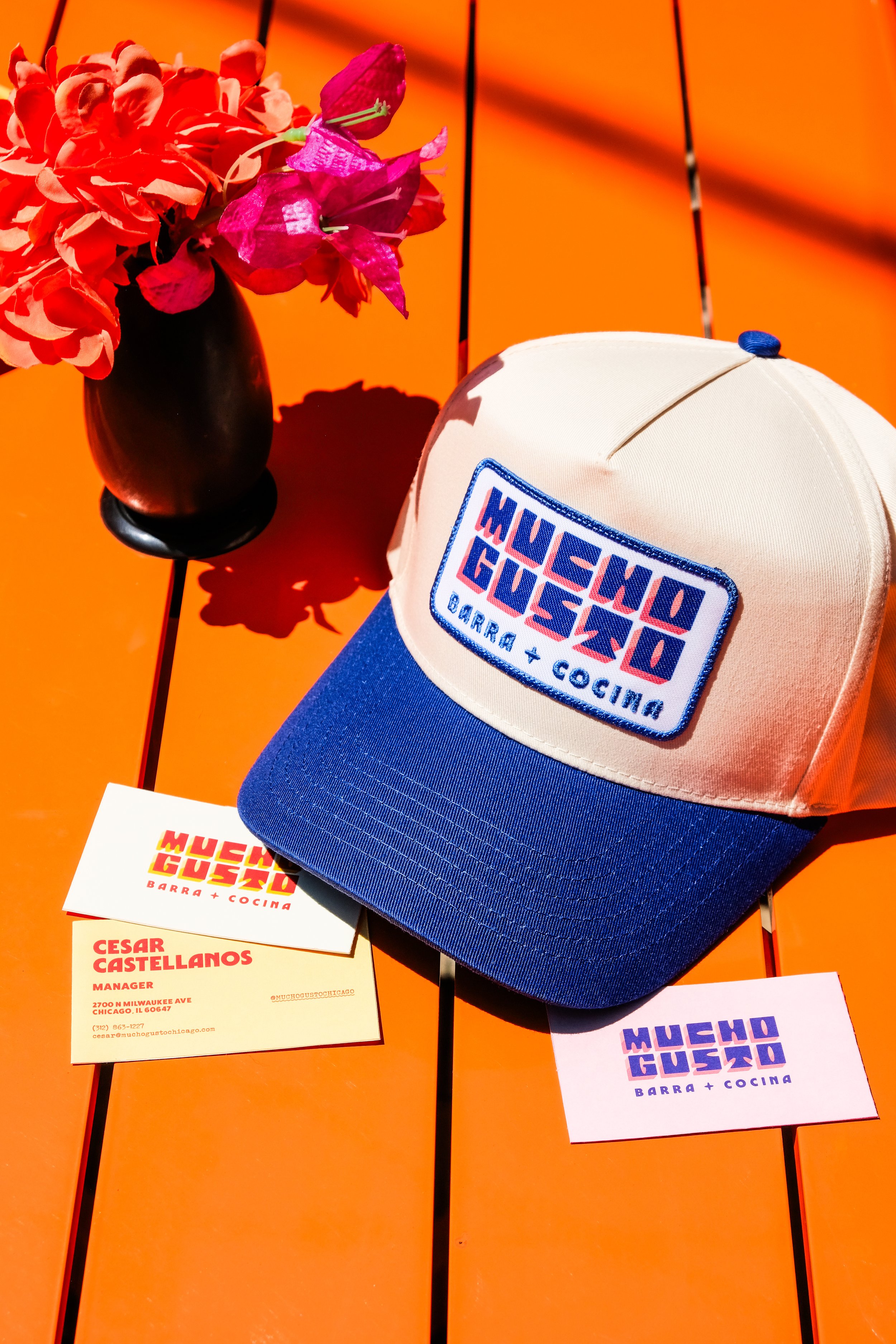
Rounded, square-based letterforms with soft corners comprise the primary logo, inspired by the worn-down cobblestone streets of San Miguel de Allende. This custom typeface incorporates arched counters derived from the clerestories of the town’s centrally-located, pink cathedral, The Parroquia de San Miguel Arcángel, which can be found painted on the walls within Mucho Gusto.
-
Brand Identity
Signage
Collateral
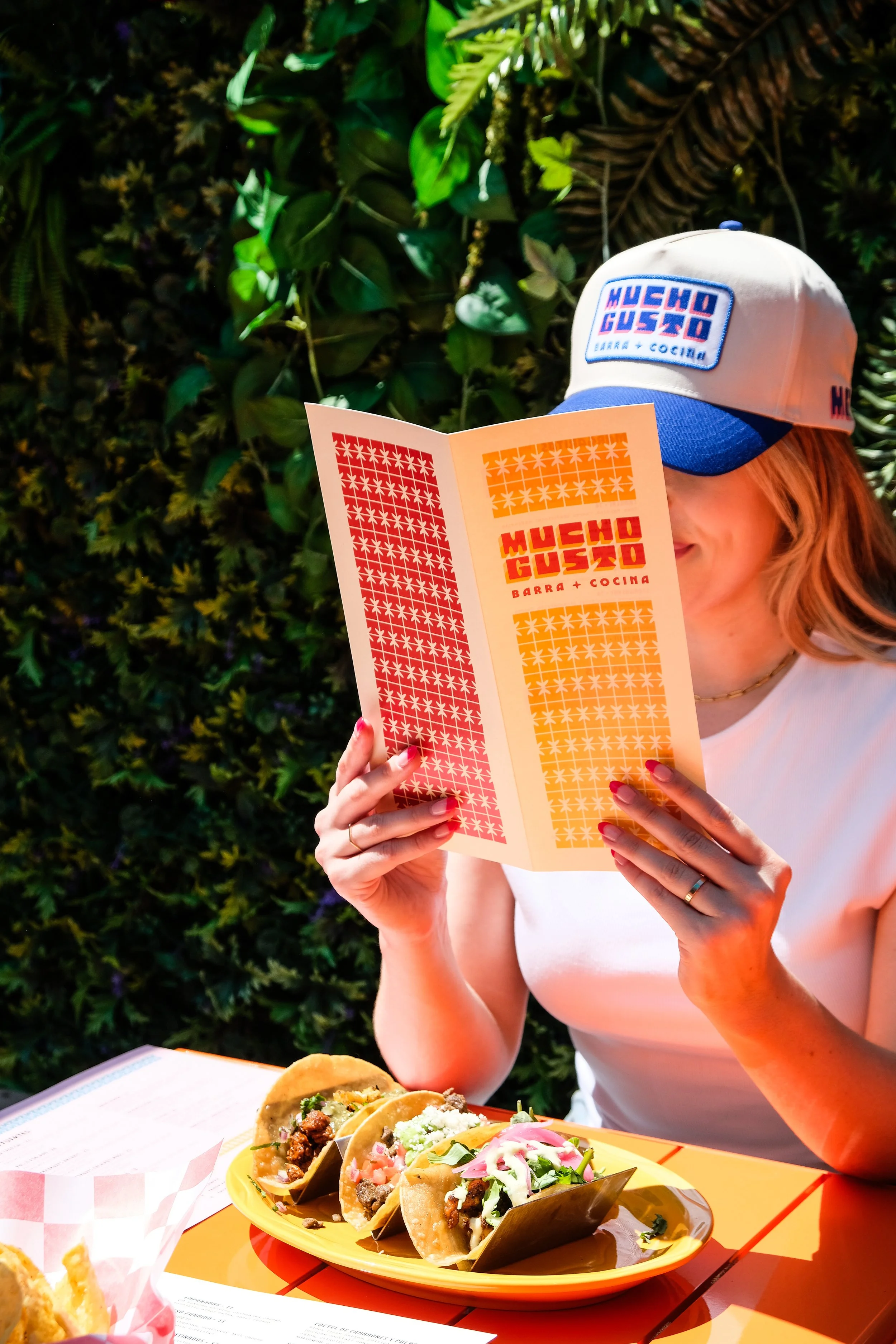
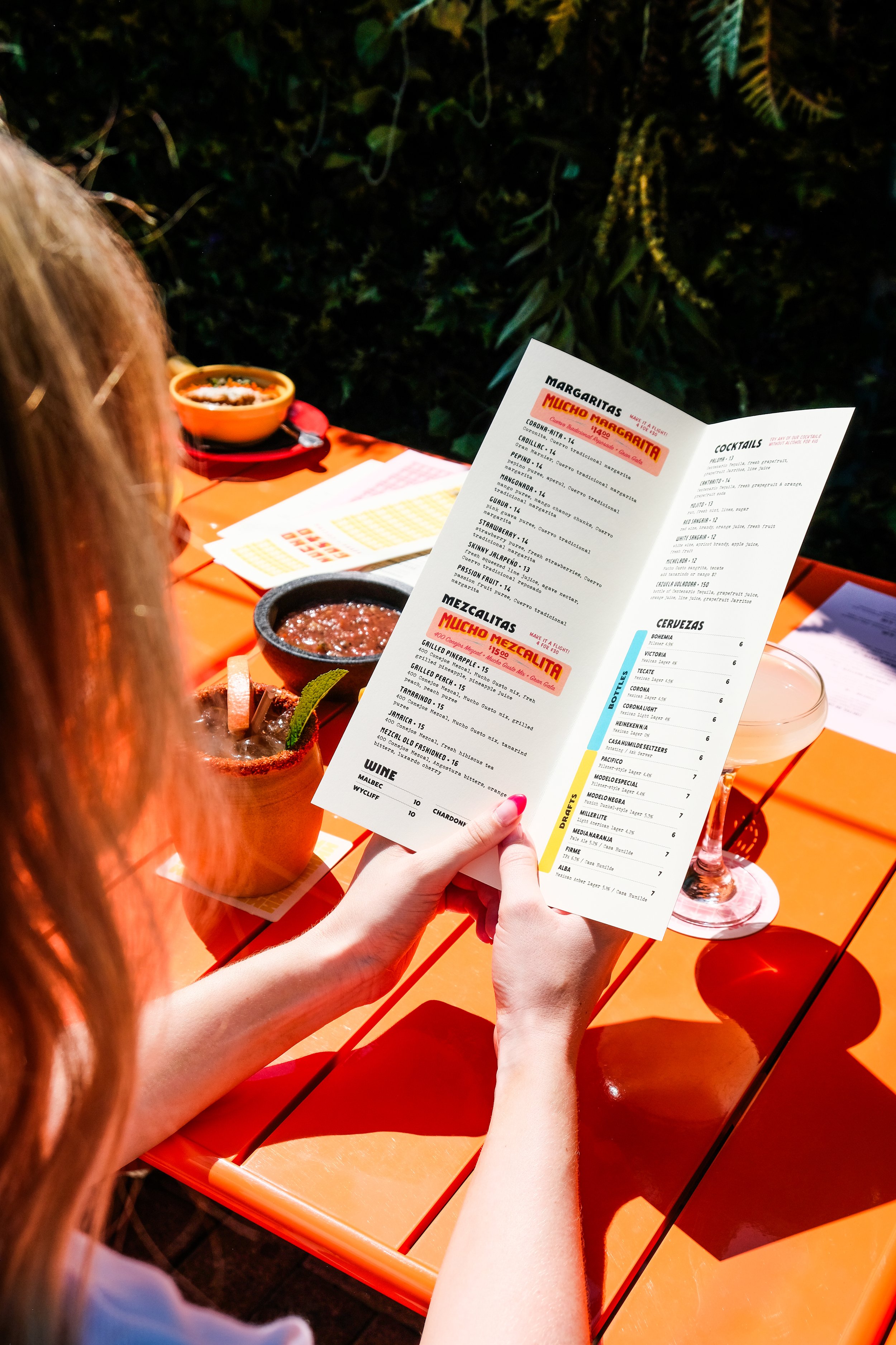
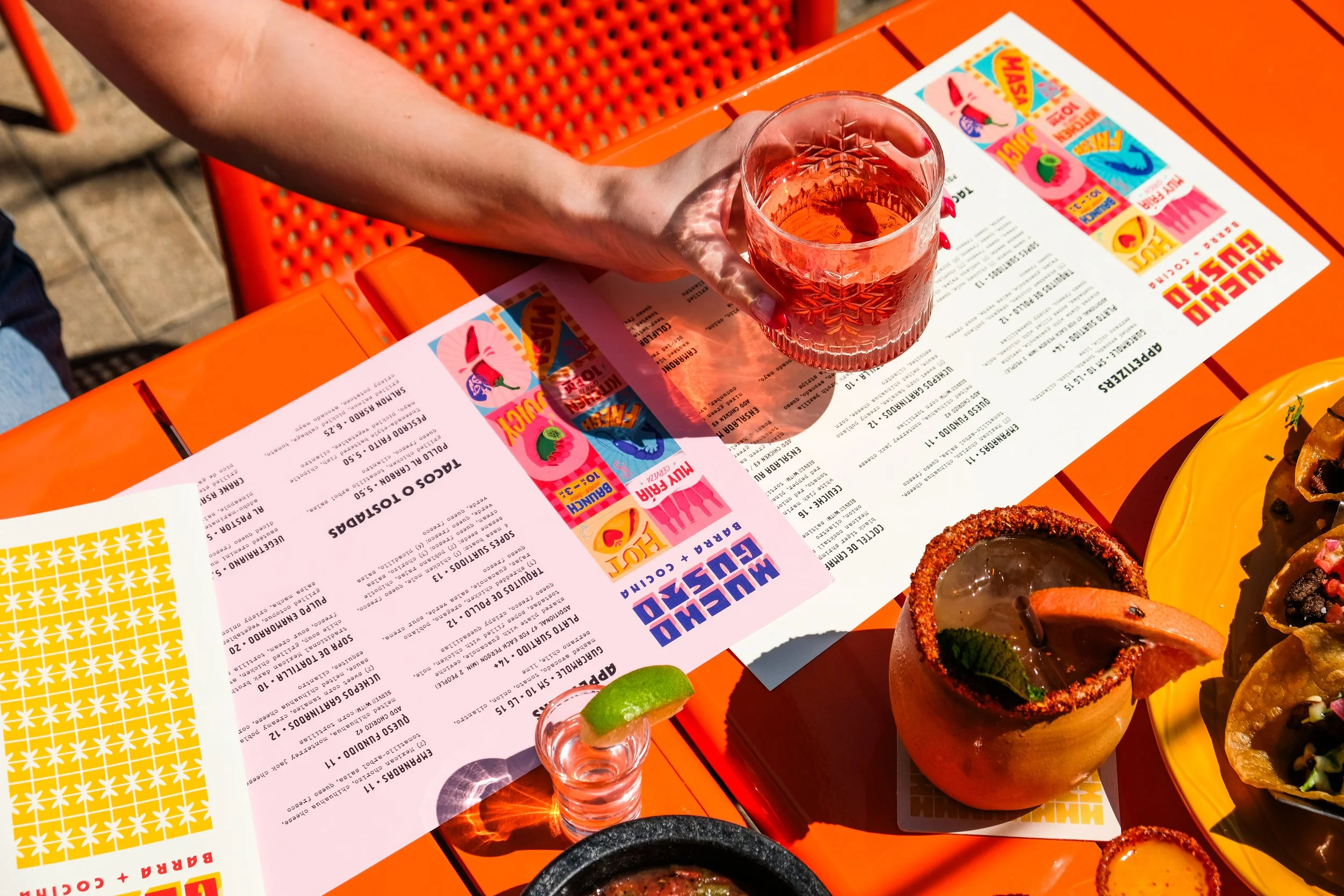
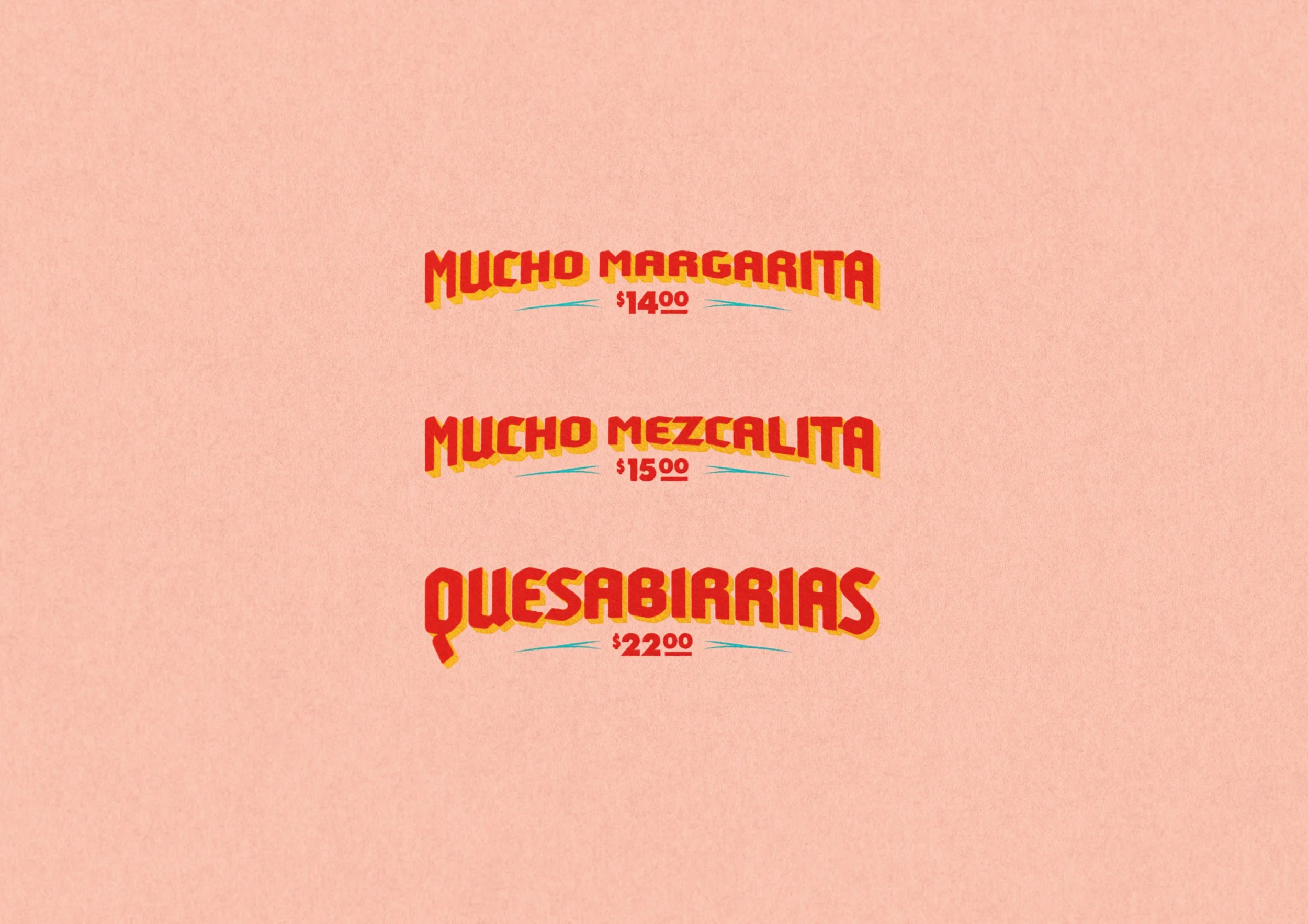
Menu Design -
Photography Mimi Lie
-
One of a Kind Hospitality


-
DISCOVERY
A competitive analysis of nearby restaurants revealed a largely uniform visual landscape, creating an opportunity for differentiation. This insight guided a brand identity built around bold color designed to reflect the restaurant’s energetic, social atmosphere as a go-to neighborhood destination.PRESSURE POINTS
As Logan Square continues to evolve, the restaurant needed a brand identity to represent it as a lively social destination while standing out in an increasingly competitive dining scene.DESIGNED TO SHINE
Inspired by the colorful interiors and the vibrancy of San Miguel de Allende, the identity translates the town’s rich visual language into a scalable brand system. Hand-drawn illustrations showcase menu offerings, while patterns echo breezeblock and cobblestones. A playful, approachable wordmark anchors the system, supported by menus designed for low-light readability in high-energy settings. Built for future franchise growth, the flexible system balances consistency with variation, allowing the brand to expand while maintaining its core personality and recognition.